Love Takes Shape: A Short Q&A with Illustrator Kate Talbot
It's been a busy few months here at GRP as we begin to prepare for our first releases in the spring of 2023. As you can probably imagine, our illustrators are working as hard as ever to finalize spreads and cover art.
Lucky for us, Kate Talbot took a few minutes to share her thoughts about making the artwork for Mary Munson's Love Will Turn You Around. Grab a notebook and a pen because we think you will love what Kate has to say about working on this project.
Our conversation with Kate:
GRP: This story has quite a few layers to it: early math concepts (shape differentiation), social-emotional learning, and primary color identification. As the illustrator, you have played a big role in bringing these elements together. You’ve made it look easy, but we know all projects pose unique challenges. What did you find the most difficult, and what tips do you have for illustrators who might encounter the same?
KT: When I first read this manuscript, I didn’t think it would be too challenging. After all, the characters were practically designed – a heart is a heart, isn’t it? I couldn’t have been more wrong.
As shape recognition is a key aspect of this story, Sandra (publisher) and Mary (author) were both adamant that nothing extend beyond the outline of each shape. This meant having all hair and accessories remain within the boundaries of the shape - and, of course, no limbs either.
It also meant that while we wanted to show the characters in action, we needed the shapes to be easily recognizable to young readers. As such, the shapes couldn’t be too distorted.
GRP: How does one show a range of emotions and actions when the character can’t twist it’s shape to meet the emotion and doesn’t have arms and legs to enhance the action? How do you keep a heart looking like a heart when it needs to hug a rhombus? I quickly realized this project was going to be harder than it first appeared.
KT: After tying myself in knots for several days, I decided the best way to approach the project was to break the manuscript down into chunks of actions and emotions and assign each chunk of text a key word to help identify what need to be “captured” in that particular image. Then without worrying about the environment, I created character sketches that illustrated that key word. For example, “Triangle tiptoed over to help” simply became “tiptoe”. I’d then focused on the quintessential aspect of that action, for example, the shape of a single foot on tip toes.
Ordinarily I might have used slightly raised arms or the shape of a characters fingers to help illustrate the action of tip toeing, but as I had none of that available to me, I simple focused on the single foot.
The result was that before I’d even thought about the story as a whole (the page compositions, environment, other story elements) I had a bunch of finished character sketches doing a variety of actions and displaying a bundle of emotions. I then built scenes around these character sketches, tweaking the characters where needed.
As someone who has a solid creative practice of “thumbnail, half sketch, full sketch, final”, this was a very backward way of working. But for this particular project it was the only way that I could break through the “how on earth am I going to do this” mentality. Having created the character for each section of text, the rest of the illustrations became a breeze.
GRP: As an illustrator, what was it about Love Will Turn You Around that sparked your creative spirit? Did you have a particular vision for the project at the start?
KT: The moment I read Mary’s delightful manuscript, I knew I wanted to be a part of it. It’s marketability was instantly obvious and her characters were so delightful - I knew right away how I wanted to approach it.
But beyond that, I always like a challenge and this project definitely presented several. As I’ve already mentioned, expressing the character emotions and actions without limbs was hugely difficult and yet very satisfying when I succeeded.
Another challenge for me was pairing back my compositions and designs. Typically I create very detailed illustrations and I’m not brilliant at working with white space. “Less is more” is a design principle I struggle to comply with. However, this project was screaming for white space and simplicity so I had to quickly become comfortable working outside my wheelhouse.
GRP: There is so much to love about the artwork in this book, but that doesn’t mean you can’t have a favorite spread. What have you enjoyed working on the most? And do you mind sharing a sneak peek of something from the book for our curious readers?
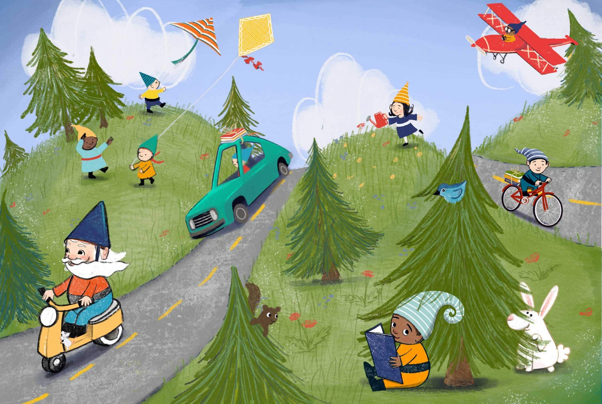
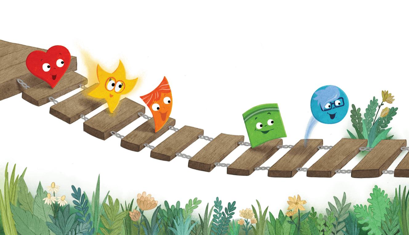
KT: My favorite page is definitely the one with the bridge. Not only is it a beautiful, heartfelt moment in the story, but the colour and energy of the characters puts a skip in my heart (pun intended). I had a massive smile on my face the entire time I was illustrating this spread. I probably looked very odd sketching away at cafes or at kid’s swimming lessons grinning like a Cheshire cat, but hey, that’s the life of a digital illustrator.
GRP: Let's share a moment when (most of) the characters are on that bridge. We are leaving out the words to keep readers in suspense, but everyone can see a lovely example of the artwork in this book. We are grateful for the opportunity to have worked with Kate and can't wait to share this bright, beautiful and heartfelt story with everyone next spring.